Not being a fashion critic, or very good at football (walking or otherwise), I’m in no way qualified to review our new kit! However, being someone who always has an opinion, I just can’t help myself!
Please bear in mind these are my views and not those of Dexter Sports Walking Football Club or any other individual (who may love the new kit!).
The kit supplier are Joma – they describe themselves as “…a Spanish family company …present in over 120 countries worldwide, and committed to the sport’s market and its own brand values…”. Corporate speak, clearly – let’s see what the kit says.
It’s got some front
What you might notice immediately is no shirt sponsor, which creates a nice clean, fuss free appearance from a distance (see below). The shirt continues the traditional Dexter’s red and blue stripes theme, reminding me, and many others of Crystal Palace. The club colours have strong brand recognition in and around Poole, where the club is better known (at the moment) for its youth teams.
The shirt is made of stretchy material, with a minimalist collar, short sleeves and a straight hem.
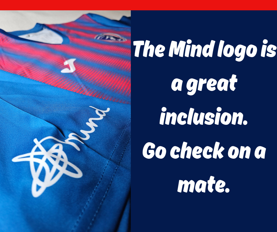
On the sleeves we’re proud to show the Mind logo, reminding everyone that mental health is a very real issue and should be highlighted.
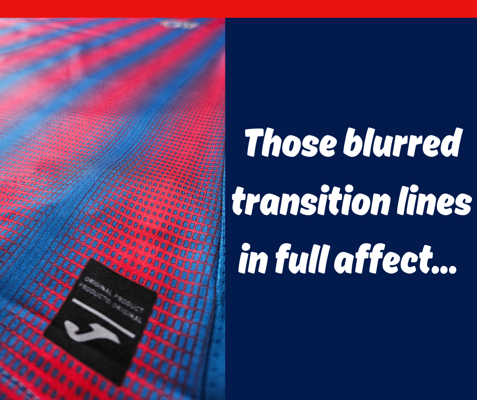
This time though, someone thought it would be a good idea to blur the transition lines between the stripes, making the shirt hard on the eyes up close, especially for anyone who suffers with migraines, I would imagine!
Overlaying the optical illusion stripes are the manufacturer’s logo and Dexter Sports club badge, around both nipple areas.
Dexters badge
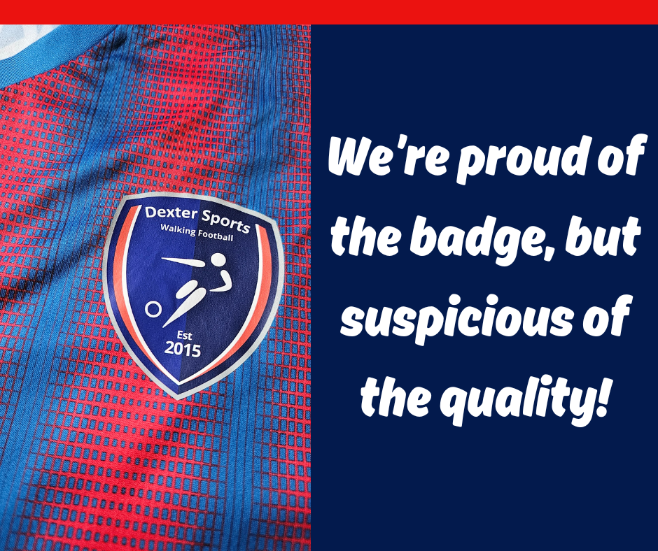
Now then, the club badge! It’s really great to see the walking football version of the Dexters badge being used. It also shows our walking football club has been around since 2015. Indeed, we’ll be celebrating ten years next year. It’s the first time this version of the badge been used on one of our shirts, which is an excellent development. However…
The quality of the badge is particularly disappointing! There’s no embroidery here, just a heat transfer, which is quite underwhelming and cheap looking.
Add in the fact there’s a recommendation to avoid using fabric conditioner in case the logo comes off, and I can’t help feeling even Joma aren’t particularly confident of the quality!
Even more logos!
Talking of logos, as well as Joma and Mind, we also have Kick It Out on the back, just below the neckline – this is another nice inclusion, reminding us all to be respectful and inclusive while playing the game.
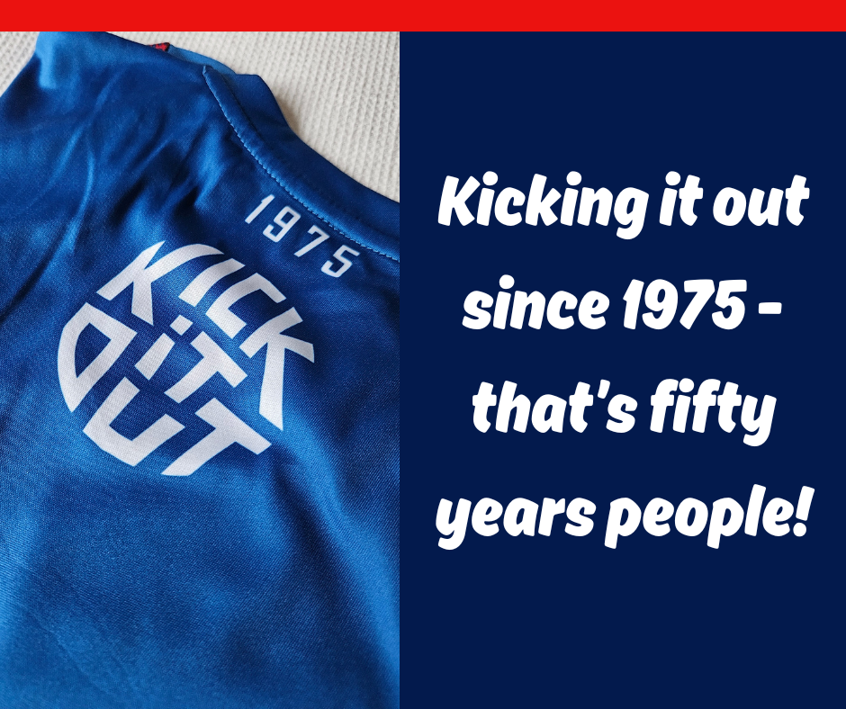
Just below Kick It Out is reference to 1975 – the year Dexter Sports was established in Poole. Again a significant (50 year) anniversary in 2025.
The back of the shirt is plain blue, in contrast to the striped front – I found that quite confusing the first time I wore the shirt in a competitive match.
With the front and back being different, it’s not always easy to pick out a teammate quickly – that’s my excuse anyway!
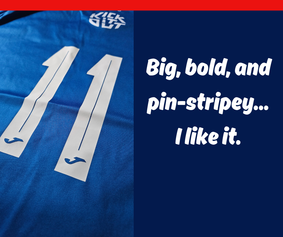
The squad numbers are nice and bold, which I like, with a blue pinstripe accenting the middle of the digits.
Short shorts, stockings and tabards
Nope, this isn’t a list of items I’d normally wear at the weekend, but we do at training on a Friday evening!
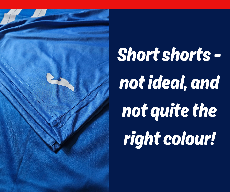
As well as the shirt, each member has also been given shorts, socks and a bib. The shorts and socks are a pleasant generic blue, but unfortunately, don’t match the blue of the shirt, which is a shame.
Another shame is the size of the shorts – for a Large, mine are quite tight. And then there’s the socks, which are super thin and blister-inducing!
All-in-all, from a distance it’s an impressive looking strip. Up close it’s a bit sketchy and the quality just isn’t quite there unfortunately.
The club has strong brand recognition locally, and the blue and red stripes re-enforce that local connection. The logos are satisfying, particularly Mind and Kick It Out. I’ll give it a 7/10.
DSWFC Response
The walking football club was kind enough to provide some feedback on the decisions which were made in selecting the kit.
“The badge issue is due to the fabric of the shirt. If it’s stitched it can pull the fabric in and cause a bunching which loses the shape of the shirt.“
“The numbers aren’t put on by Joma but our local supplier. Joma don’t advise against fabric conditioner, neither does the local printer. We added that advice as in many years previously it used to be the case. Since then the hot printers have improved, but I’m a cautious type. Feel free to use conditioner but if the numbers peel they really do look awful.”
“We hope the quality [of the socks] lasts a couple of seasons, especially as we use them weekly year round. We went for a modern look for the shirts. We agree it can be a bit to look at but hopefully only the opponents are affected by the blurred edges.“
“The campaign logos are a club wide initiative to support these causes.”